Monday, December 7, 2015

Creating Custom CD Labels

The compact disk may very well be on its way to becoming a relic of the past, but for the moment it still remains a reliable way for me to get pictures from my computer to a paying customer.  When I first checked into custom labels I honestly believed I NEEDED to purchase a program to create the design and print evenly on a round label, as well as an apparatus to apply the labels to the CDs.


After playing with a label maker my dad had been using, I decided I was crafty enough to come up with my own way to get pretty labels onto CDs and still make them look straight and semi-professional.

Here's the tutorial:

I like my disks to be completely covered, so I use Stomper CD Labels because you can either remove the center ring to expose the clear portion of the CD or use them as I have for full coverage.


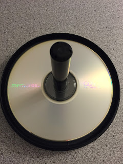
The only material you need (besides a computer and blank labels) is an empty CD tower and the clear protector that comes in the bottom of it.

Using Word, I scaled down my document so the page on the screen was the same size as a normal sheet of paper, which in my case was 94%.  If you don't know how to do this, click 'View' on the top panel, click 'Zoom', and then play with the 'Percent' until you find the number that will display the true size of your document.


Using the same method, I lined up my blank CD label sheet to ensure that my design was going to thoroughly cover the disk and nothing important was going to fall into the center hole.

Print your label.

Drop the clear protector onto your empty CD tower.  This keeps your data-filled CD from getting scratched.  Place your CD on the tower label side up.


Remove the label from the paper.  Hopefully, the brand you choose has the handy little holders like mine did because they can be quite useful.


Carefully slide the label down the tower and let the center pole help you line up your label.


Once your label is applied, tear away the holders and smooth down all the edges of the label so nothing will get off balance when the disk is spinning in a machine.

Please visit my website
www.AshleyGesslerSHD.com

Tuesday, October 6, 2015

Not all edits are created equal

I have had a few people stop me and say they tried editing their photos, but are generally disappointed with the results.  Let me just say, I hear you loud and clear!  Back before I started taking classes on photography and attending workshops on photo editing, I found myself getting more and more frustrated with my own editing results.  Every once in a while I would get lucky and have a picture turn out really amazing with the edits I applied, but I never could pin point why one picture would turn out great while the next (with the very same edits) would turn out blah-zey.

In most cases your editing outcome has nothing to do with your image... it has everything to do with what that preset edit is designed to seek out and change.  If your image doesn't have what that edit is looking for, then it can't edit it correctly.  Make sense?

To edit a great picture, you first have to START with a decent picture.  All the basics have to be there: your subject needs to be shot at the appropriate level (Read: Improving Your Pictures With This One Tiny Adjustment), your background needs to be clean (Read: What's Up With Other Peoples' Photos?), and your subject needs to be sharp and in focus (Read: Have You Heard of a Shooting Mode?).  Regardless of how much editing you do a photo of the top of someone's head will still be a photo of the top of someone's head when you're finished, so you need to be sure you're starting with a quality image first.

It may be a 90 degree October day here in Alabama, but I'm dreaming of cooler weather, so I'm going to use mostly snow pictures for the sake of this blog.  The first was taken while the snow was freshly falling, and the second was taken the next morning of the same bush.


All of these images are completely raw and untouched.  They are decent enough, but let's add some editing touches and see what happens to them.

I'm using a preset I created in Lightroom specifically for my snow photos.  I call it Sweet Snow Sharper.  When using an editing software such as PicMonkey or Snapseed you won't have access to seeing what exactly the effect is designed to do, but after applying it to your images a few times you can probably figure out what exactly it's changing.  Is it darkening your shadows?  Is it lightening your image?  Is it applying a color change?  Is it softening the picture?  Etc.  Etc.  Etc.

Sweet Snow Sharper editing presets

Sweet Snow Sharper is designed to brighten up the typical overcast skies that can be found on a snowy day and bring out the true white by canceling the bluish haze.  In the right conditions it produces a beautiful image such as the one below.  On the left is the original photo, and on the right is the same image with the Sweet Snow Sharper edit applied.  Pretty and white!

Left: Before.  Right: Perfectly white snow with Sweet Snow Sharper

Now, this second image was taken the next morning.  The skies had cleared and the sun was brilliantly shining.  The 'Before' picture was pretty clean on its own, and once I applied the Sweet Snow Sharper edit it fuzzed out my whites and had a truly detrimental effect on the overall image.  The whole thing is glaringly bright.

Bleck!  Same editing tool, but this one turned out too bright!

So, what happened?  My base images were vastly different.  They were shot in completely different lighting conditions, therefore the edit produces completely different results.  This edit brings a brightness that the second image did not need, so the edit unnecessarily brightens the whole picture.

Let's look at another example.  This edit is with my preset Lava Rock which is designed to bring out the contrast between the light and dark areas of the image.  It works well on a well-lit subject to intensify the details.  Just look at how it makes the flower in the lower image seem to pop!

Left: Before.  Right: After applying the Lava Rock edit

When the same Lava Rock edit is applied to our snow photo, it darkens the bush and makes the whole picture feel drab and dreary.  It's a far cry from the edit with Sweet Snow Sharper!

Left: Before.  Right: After applying the Lava Rock edit.  In this situation it looks terrible!

If you're using an edit supplied in one of the editing tools we mentioned in an earlier post (Read: My Preferred Programs For Editing) then you may or may not know exactly what the edit is designed to do.  When I'm using a program such as PicMonkey, I like to apply a chosen effect, see what it does, and build from there.  If the edit produced a yucky picture then I wipe it out and try something else.

Editing can be a tricky business, and no one is ever truly finished with learning about how to improve images.  It's always a never-ending process of evolution, so don't give up!  I went through years of yucky edits before I started figuring things out, so there is hope for everyone.

Please visit my website
www.AshleyGesslerSHD.com

Friday, August 7, 2015

Filling the Frame-- Anyone Can Do It!

I'm really not sure why, but this has been a difficult lesson to learn.  It took me years to finally put my finger on why the vast majority of my pictures were turning out blah.  It's actually rather painful to show these, but we all started somewhere, right?

This is what my photography used to look like before I learned to get down on my subject's level (Read Improving Your Pictures With This One Tiny Adjustment), image balance, yada, yada, yada.

 My old photography skills.  Why did they always feel "empty?"

I knew there had to be something I was missing.  I knew deep down that I could turn out better work than this and I was determined to figure out why.  I began going through my collection of candid shots.  They were rough around the edges (some of them even made me cringe) and I started paying close attention to my favorite images and why they seemed so different to me.  This activity is very similar to an exercise I later did during one of the photography workshops I attended many years later.  Read about it in What's Your Style?  And, How To Find It.

What I started noticing was a high percentage of my so-called blah images had great deal of "blank" space.  For instance, in the image of my daughter she looks rather small in the photo.  The background plays a much larger role and it is not until later that you notice her puffing out her chest.  The same is true for the photo of the horse jumping.  I did my best to edit out the distracting objects by fading them to black and white and leaving only the subject in color, but the distracting objects are, well, distracting.  They feel like clutter, and clutter takes away from the purpose of the photo.

Now, I couldn't tell you where I picked up this little trick... but fill the frame with your subject.

Oh what a difference getting close up makes!

Don't be afraid of getting up-close and personal with whatever or whomever you're shooting.  9 times out of 10 getting closer will take a typical candid (like the one on the left) and bump it up to an instantly better shot (like the one on the right).


 Depending on your camera and zoom capabilities, it's not always practical to get as close as you would like.  In point and shoot digital cameras, you generally have two types of zoom: optical and digital.  Optical zoom is what I like to call your "physical zoom."  It gives you a mostly-accurate representation of you having moved closer to you image.  It generally does not lower the quality of your final image.  Digital zoom is a completely different animal.  Once the camera has physically zoomed in as far as it can (the lens moving out and away from your camera) that is when your digital zoom kicks in.  The camera is essentially taking a snipit of what you see in the viewfinder and blowing it up to a normal picture size (phone cameras operate this way and for that reason most zoomed-in pictures will have a grainy appearance if you have them printed).  The images you get from a digital zoom are generally more grainy.  Technology has improved greatly, but in my opinion an optical zoom is always the way to go.

**The best way I can describe a digital zoom is to think of making cookies.  When you roll out the dough you have a correct thickness and texture.  Okay.  Take a cookie cutter and cut out a small portion for a circle-shaped cookie.  It looks and feels fine as long as it remains tiny in comparison to the original sheet of dough.  Now, if you were to take a rolling pin to that small cookie and try to stretch it to the same size as your original batch of dough, the cookie is going to become extremely thin.  It will tear, and have holes, and look absolutely terrible-- not to mention it will burn almost instantly when you put it in the oven.  This is essentially what a digital zoom is doing.  It is taking something small and trying to make it fit a larger frame to zoom in.  In most cases, the results are less than desirable.**


Moving in closer both physically and optically (which means sometimes my daughter complains that I am "up in her face" with the camera, but oh well) gave me an instantly-improved image.  There is less background to worry about being cluttered and there is more expression in the image itself.  Used in conjunction with the trick of getting down on your subject's level (Read Improving Your Pictures With This One Tiny Adjustment), filling the frame with whatever you are photographing will usually give you better results... and it's something anyone with ANY type of camera can do!

Try it for yourself and see what kind of results you get!

Best wishes, and happy photographing!

Please visit my website
www.AshleyGesslerSHD.com

Tuesday, July 21, 2015

My preferred programs for editing

You've learned to look at your backgrounds so you don't have chair legs appearing to pop out of your child's head (http://sweatyhorsedesigns.blogspot.com/2015/06/whats-up-with-other-peoples-photos.html), you've pinpointed your photography style (http://sweatyhorsedesigns.blogspot.com/2015/06/whats-your-style-and-how-to-find-it.html), you're playing with the shooting modes on your camera (http://sweatyhorsedesigns.blogspot.com/2015/06/have-you-heard-of-shooting-mode.html), and you've learned to get down on your child's visual level (http://sweatyhorsedesigns.blogspot.com/2015/06/improving-your-pictures-with-this-one.html).

You're pretty much a picture-taking boss!  You're turning out some pretty awesome shots and now you're wondering, how do I take these to the next level?

The answer is editing.

Before and After.  Use editing to bring out the natural beauty in your image.

If you're photographing with a DSLR camera and have massive photo files, I would strongly recommend using a professional photo editing software.  I use Adobe Lightroom.  I love the program because it allows me to edit multiple photos at one time and create a common feel to all my images.  It also allows me to save my own preset edits, choose my file output and size, apply my own watermarks, etc.  It's an absolutely wonderful program, though a bit labor intensive and unnecessary in some situations.  If you are looking for a professional program... look no further!  It's worth every penny.  If "free" is more up your alley, I'm going to point you in a different direction.

Lightroom is my choice of editing software for that professional look and feel.

Let me introduce you to an app my dad turned me on to.  It's called Snapseed.  It is the stuff of dreams for phone photos that you would prefer to not have to download to a desktop in order to edit.  Both Android and iOS users can enjoy this, so look for it in your app store.  Its editing power is rather basic, but that's all you really need to get started.

Snapseed's logo used to be the LEFT image.  Now, it uses the RIGHT image.

If you're looking for a program that has a little more oomph but still remains within the "free" parameters, then get ready for PicMonkey (http://www.picmonkey.com).  PicMonkey, formerly known as Picnik, is a fun-filled online editing program that does all the basic stuff, but includes a great deal of bells and whistles too!  There are some effects that they charge for (and I was a paying subscriber for years, so I can vouch for how wonderful having access to some of those extra little do-dads can be), but all the main stuff is free.  You just have to put up with a few ads on your screen, but it's totally worth it.

PicMonkey's page changes regularly, but this is how it looks today.

There are plenty of other editing programs out there (both free and ones you pay for), but these are the three that I prefer over all the others.  Professional: Lightroom.  Mobile: Snapseed.  Desktop: PicMonkey.

We will go into detail on how to really get a handle on using these programs for the betterment of your pictures, but for now, have fun exploring.

Enjoy!

Please visit my website
www.AshleyGesslerSHD.com

Monday, June 8, 2015

Improving Your Pictures With This One Tiny Adjustment

The quickest and easiest tip I can give to fellow moms who want to improve the pictures they take on their point-and-shoot cameras is this: GET ON YOUR CHILD'S LEVEL.

How many of us have countless pictures, like this one below, where you're looking down on the top of your child's head because you were standing at the time or sitting on the couch and you wanted to snap a quick photo of your kid doing something adorable?

Blah mommy-picture moment brought to you by ME

It's all well and good to snap pictures and try to capture that fleetingly adorable moment, but also make the effort to get yourself down to eye level with them ASAP!  This was the single "Aha!" moment that transformed my photography from typical (as picture above) to beautiful (as pictured below), and all it requires is a little effort on my part.

A MUCH better photograph and one that I have proudly hanging on my wall at home

Sure, it means I get a little dusty and it can be really rough on the knees at times, but it is the easiest photography secret to learn and carry into your own pictures.

It's tough to look back on my old photographs and admit that I knew virtually nothing about picture-taking back then.  Most of my decent pictures were happy accidents.  I knew a great picture when I captured it, but I couldn't have told you what I did right to replicate it in the next situation.  I had a love for cameras, and according to my mom, "A natural knack for the art," but I needed to learn so much more!

If you're like I used to be back then, I thought editing would be my magic cure-all for what I knew was missing from my photographs.  SURPRISE!  Editing can do nothing to correct a picture that wasn't taken correctly to begin with.  Getting down on your child's level, ensuring you pay attention to what's in the background (http://sweatyhorsedesigns.blogspot.com/2015/06/whats-up-with-other-peoples-photos.html), and keeping your photography style in the back of your mind at all times (http://sweatyhorsedesigns.blogspot.com/2015/06/whats-your-style-and-how-to-find-it.html) helps you point the camera in the right direction, at the right level, to produce a photo that you can impress yourself with!

*TIP*: Get down at the same level as your child for the best picture-taking moments.

Please visit my website
www.AshleyGesslerSHD.com


Friday, June 5, 2015

What's Your Style? And, How To Find It.

If you're like me, you love to look through beautiful photographs and wish you could take pictures like that.  I have a few photographers I follow regularly, and I find myself "oohing" and "awwing" over the unique perspectives and the overall feel of the images.

In one of the photography classes I took online, I was given the assignment of pulling pictures from the internet that "spoke" to me and then analyze them to find the common thread.

Here are the pictures I pulled from a quick Google search of "horses" and then selecting "Images":


 Do you see the common thread?  I discovered that my personal photography tastes are drawn toward the vantage point of a child.  (I also really like black and white images, but that's a topic for a later post.)

Pulling the pictures and placing them all in a single folder together gave me the opportunity to see what I'm drawn to and what appeals to me.  Yes, these are all horse photos, but I try to carry that unique perspective that I love so much with me into the rest of my photography life.


Does a child's vantage point work for every shot?  Absolutely not.  However, I always keep it in the back of my mind.

What else do you notice about the pictures?  I noticed that very few of the pictures were "full shots."  Most, in fact, are simply a sliver of the full picture.  Ever single image focuses on a single detail, something that makes it unique, and then amplifies it.  The ribbon, the rider's outside leg, the bend of the horse's neck, the whiskers on the nose... it's what I would discover to be "detail shots."

I'm sure you can pick out a few common features all these pictures have, but the ones I have mentioned are the biggest ones that stood out to me and guided the direction I would go as a photographer.

So, now I ask you to do the same exercise.  Pick a theme that you love.  Mine was horses, but yours may be children, or landscapes, or dogs, or whatever else tickles your fancy.  Set aside an area where you can save all your pictures in one place.  Do a Google search and start saving some images that really speak to your creative side.  What do you love to look at?

Take a few minutes to go back and study the images that you have saved.  What's your common thread?  Is there a color scheme that is repeated?  Do you prefer a certain vantage point?  Is it an unusual balance in the way the photo is cropped that speaks to you?


Visit www.picmonkey.com and drop the pictures you've selected into a collage as I have done with the images above.  It doesn't have to be anything fancy, but give yourself a representation of where you would like to see your photography take you even if your sole purpose is to take better pictures of your kids.  There is absolutely no shame in that!

What you'll wind up with is a collection of images that inspire you.

*TIP*: Put together a collection of pictures that inspire you.  Search for a common theme that runs through the majority of the images.  What photography styles have you discovered that speak to you?

Please visit my website
www.AshleyGesslerSHD.com


Thursday, June 4, 2015

What's up with other peoples' photos?


So, you're strolling through your Facebook feed and you happen upon "SuzieQ's" photos of her kids in the swimming pool at their house.  As you look through picture after picture of seemingly perfect perfection you begin to feel that little green monster of envy creep back into your mind.  "Why do SuzieQ's pictures always seem to look better than yours?  And, how does she do it?"


True, some people simply have a knack for telling a beautiful story with a single photograph, but I'm going to let you in on a little secret; virtually none of those photos came straight off a camera and onto the web without serious thought and planning being put into the image BEFORE it was taken and without some form of re-touching AFTER it was taken.  The idea that great pictures just happen is a bit misguided.  There are moments where the photographer just happened to be in the right spot at the right time, but those incidences are few and far between.  Most photographers put serious thought into an image long before they ever put the view finder to their eye (and some super-skilled photographers are even gifted enough to simply point the camera in the right direction from hip-height and wind up with an excellent shot).

The neat thing about photography, though, is that literally anyone can do it, and anyone can learn a few tips to improve the skills they have already acquired.

For starters you need nothing more than a digital camera with a decent resolution.  Don't know what that means?  If you can pull up some stats on the camera you will be working with, you want to look for how many megapixels your camera has.  Megapixels are the individual dots that your photo is made up of and while a higher number of megapixels doesn't necessarily represent a higher quality image, it's a good place to start.  (For more serious and in-depth reading on the subject read http://photography.tutsplus.com/articles/an-in-depth-look-at-megapixels-and-resolution--photo-8914.)  Most cameras with 8 megapixels or higher will put out a decent enough image for computer screens and small prints up to 5x7.

Next, you want to determine what type of camera you're working with if you don't already know.  Are you using a point-and-shoot or a phone camera that does all the adjustments for you?  Are you using a professional-type DSLR like the Canon Rebel?  Or, are you using a hybrid of the two that offers a few customizable settings but functions primarily with automatic settings such a Nikon Coolpix?

No matter what you're working with, set it to the green AUTO setting and let's go from there.


Before snapping a picture, take a moment to look through the viewfinder (or sneak a peek on the back display).  Every picture has a story to tell and it's important that you figure out what that story will be before you get started.  Take for example these two pictures of my daughter.  These were taken at the Montgomery Zoo in June of 2015 while we were preparing to feed the giraffes.  The picture on the left is a pretty typical candid shot where the photographer is looking down on the child, there are feet in the frame, it's not cropped well, etc.  It's blah and it really doesn't say much about what was going on.


After my lackadaisical moment of forgetting to be a photographer instead of a mom, I snapped back into picture mode and made the image tell more of a story.  I instructed my daughter to hold the cup of alfalfa up to the camera, I zoomed in just slightly so my husband's feet could no longer be seen, and *snap*!  Instantly, the photo is much better and says, "We're going to feed some critters!"  It's not a professional image by any means, and I could have done more to ensure I had a truly clean background, but munchkin was antsy and it's certainly an improvement over what I had earlier.

*TIP*: Pay attention to your background.  What is behind your subject that could potentially interfere with the image?

*TIP*: What story are you hoping your picture(s) will tell?  Keep that in mind the entire time you're shooting.

Please visit my website
www.AshleyGesslerSHD.com