Thursday, February 18, 2016

So you bought a DSLR camera... now what?

Buying a DSLR is a big step.  Not only is it a large investment in and of itself, but it also has an endless array of accessories, lenses, and filters to create different effects in your final image.  Keep in mind that a camera can only be as good as its photographer, so my best advice before you go sinking gobs of money into "new toys," is to start with the basic package and learn to use what you have.


My basic package included the Canon Rebel T3i body, 18-55mm zoom, 75-300mm telephoto zoom, an external flash, and some various filters.  Very basic, but to be honest, I didn't need anything else in the beginning.

It can be overwhelming when you begin to tackle Manual mode, but that's what you bought the DSLR for, right?  To have a camera that is capable of capturing those super unique visions you have in your head?  AUTO mode captures some really beautiful pictures on my Canon, but sometimes I want to think outside of the box and capture something truly unique, and that's where Manual mode comes in super handy.

How I got starbursts without using a filter.
f/29, 2 second shutter, ISO 3200, AUTO white balance, AF one shot

This image was shot in AUTO mode with the flash disabled.  Note that the image looks
very typical and there is no way to get the starbursts that are found in the first image.

There are some days where I feel exceptionally lazy and I just do not have the patience to deal with Manual, or things are happening entirely too fast (such as rapid lighting changes) for me to possibly keep up.  In those situations, I fall back on AUTO mode or some variation of it, but those instances are getting fewer and further between.

To be successful at mastering Manual mode, you need to have at least a basic understanding of what settings you have at your disposal and how they affect your image, as well as each other.

The first thing you want to ensure is set correctly is your Image Quality.  There are many different options you can choose from, but I use the setting seen to the right with the single wave next to the L for everything except paid professional sessions.  The option seen in the picture allows for the highest quality JPEG image.  The options below it all represent lower quality images.  If you ever get confused on which letter represents the higher quality images, simply look at the number inside the [ ] brackets to see how many pictures will fit on your current memory card.  The lower the quality of images, the less space it requires to store them.  Thus, you can fit more low quality images on a card than you can high quality images.  With the single wave L, I can fit [1586] pictures on my current card, while I can fit [9999] in S3 quality.  S3 is therefore a much lower quality image.  When I tab over to RAW I see that I can only fit [439] images on my card.  This may be tempting to try since it yields the best image, but RAW files cannot be read by a typical computer's image previewer.  You have to convert the RAW files to JPEGs through a picture editing service (I use Adobe Lightroom) before you can do anything with the images.  Unless you are being paid for your images or have a need to blow one of the pictures up to the size of a billboard, a large JPEG will serve you just fine.

The next thing to set on your camera is your Drive mode.  When you press the button to take a picture, this will determine whether there is a delay until the camera takes a picture (two right options), whether it takes a single picture (far left setting), or whether the camera will continue to take pictures until you release the button (highlighted option).  I typically use the Continuous shooting, but a drawback can be that the camera will only focus once and then continue to take pictures in the original focus unless you specify that you want your camera to continually re-focus in your Auto Focus settings.

Ah, the beautiful Autofocus!  This is a setting I somehow overlooked until just last year, and now it has revolutionized my picture-taking skills!  My camera has three different settings: One Shot, AI Focus, and AI Servo.  For years I had been using One Shot because it had come standard on my camera.  However, after reading an article online, I discovered AI Servo.  Remember me stating that a drawback to using Continuous Shooting can be focus issues?  AI Servo fixes that.  One Shot works best for subjects that don't move, like landscapes.  The camera focuses one time, and because the subject doesn't move, the camera doesn't have to re-focus again.  It continues to take pictures and every picture comes out sharp and clear (as long as you have your other settings adjusted correctly.  More on that later!).  AI Focus is my second-favorite focus mode, next to AI Servo.  When you look through the viewfinder and press the shutter button partially, the camera will focus on a subject and then blink a small red dot over whatever it has focused on.  The dot can move around anywhere to show what the camera has focused on.  If the subject suddenly moves, the camera will do its best to re-focus as long as the subject doesn't suddenly run toward or away from the camera.  I like this mode for producing pictures that follow the "Rule of Thirds" or any other shot where I want my subject set off-center.  AI Servo is the best method of capturing a subject that likes to move a lot.  AI Servo works by continually re-focusing the entire time the shutter button is partially or fully pressed.  It's excellent for action shots, but can be draining on your battery, so if you actually don't need your camera constantly focusing, it's better to stick with AI Focus.  Also, with my camera, AI Servo will only focus on the subject that is exactly in the center of my viewfinder.  If I accidentally let my camera wander a little to the side of my subject, the camera will focus on it (which usually winds up being the grass in the background) instead of my subject.  AI Servo is extremely handy, but you have to be exact in the way you use it.  For this reason, I find myself switching between AI Servo and AI Focus quite frequently.

Please visit my website
www.AshleyGesslerSHD.com

Let's Blend Together!

Have you ever wanted to blend two images together into a single photograph without it looking like a collage?  I learned to do this ages ago with PicMonkey (back then it was called Picnic) and I'm going to walk you through my method.  There are literally thousands of other ways to do this, but this one is mine and I'm going to teach it to you!

You do not need to sign up with PicMonkey in order to go through this tutorial.  You just won't be able to save any of the edits you make with Royale tools (the ones with the crown symbol on them).  Most of the editing tools are free, though.  PicMonkey does usually offer a free 30-day trial to new users.  You do have to have a credit card to sign up for the free trial, but you can cancel at any time before your month is over and not be charged.  I used PicMonkey exclusively as my editor until I invested in Lightroom and Photoshop, so I can vouch for what a wonderful tool it is if you have access to nothing else!

**Please note that PicMonkey does not work on mobile devices to my knowledge.  This is for computer users.

Let's start with a few images.  These pictures were shot on my trusty Canon Point and Shoot in 2010.  These are my grandparents with my daughter, Skyler, their only great-grandchild.


Go to www.picmonkey.com and choose a canvas for your final product.  I choose Custom and set my width to 4000px and my height to 2000px.  I need enough space for my pictures to fit side by side so I can work... and you'll see why in just a minute.  You can always play with your canvas sizes if you find you need to make adjustments in order to accommodate your blend.


Next, you are going to insert the pictures you want to blend by choosing Overlays (the butterfly icon), click Your Own, and navigate to the appropriate folder in your computer.  You can only import one photo at a time, so repeat the process for the additional photo(s).


Once you have imported your photos you can use the corner arrows on the images to scale them up or down in size as I have done.  You want the pictures next to each other on the canvas.  (Don't worry... we will crop to the appropriate size after we have finished editing.)  Click Save and save this image to your computer.  You will need to hit the small white X in the upper-right corner of the editor to close out the image (not the red X which will close out your entire browser!).  PicMonkey will return to the opening screen and instead of clicking Design to choose a canvas, we are going to click Edit and open the image you just saved on your computer.


Now comes the fun part!  Click the Effects icon (the magic wand) and scroll all the way to the bottom.  We are going to be working with the Clone tool.  (The funny little orange monkey will show up until you either purchase or go with the 30-day free trial.  You can play with the Royale tools for free.  You just cannot Apply any of your changes without signing up.)

**Please note that the Clone tool does not work with Overlays at this time, so you cannot skip the step of saving your canvas with the two pictures on it as a jpeg to your computer!


Use the slider to adjust your brush size and hardness.  For this project I am using a 400px brush with a 0% hardness (hardness has to do with how sharp and clear your edges will be.  Place your dotted brush over the part of the picture you are wanting to blend over the other picture.  This is your target area, or your source.  When you click over your desired area, the target will lock onto the picture.  Want to readjust where your target is sitting?  Simply click Source on the left side of your screen and place your target again.


Once you have placed your target your mouse will change to a solid circle.  This is your brush you will paint with.  Move your brush to the place you want to begin blending and click and drag.  As you continue "brushing" you will notice that your Source and Brush now move together.  Whatever you see in your Target area will be copied to where your Brush is clicking.


Let's say I get a little over zealous and accidentally put too much of the clone in and cover my grandmother's face.  Easy fix!  Simply click Eraser, click the areas you want to "erase," and when you're satisfied, click Eraser again to return to your locked-in brush tool.  Do NOT click Source unless you want to move your original source.  This can lead to misaligned copies if you weren't completely finished copying.

Oops!  I accidentally covered my grandmother's face!  Click Eraser, click the parts you want to remove, and then click Eraser again to return to your previous brush.

What you wind up with is a single image containing two pictures.  Once you are satisfied with what you have, click Apply.

**If you opted not to sign-up with PicMonkey you won't be able to save your Clone edits, but you can still use the following edits for free.

Return to the Basic Edits icon (the square) and crop your image.  There is a drop-down box with standard picture sizes.  Choose the size you are wanting, drag over the image (if you need to change the orientation from portrait to landscape-- or vice versa-- just drag the crop corner in whatever direction you are wanting to change the orientation to and the crop tool will flip accordingly), drop, and make any necessary adjustments.  Click Apply.


You now have a blended image, but wait!  We aren't finished yet!  

Return to the Effects (the magic wand) and click the Soften effect.  We want to hide the seams between the images even more.  Soften will place a fuzzy layer over your entire image.  Move the sliders for Soften and Fade until you have a suitably "soft" image.  I set my softness to 67% and my fade to 30%.  See that little paint brush icon beside your fade?  Clicking it will pull up a brush (just like your copying brush we used in the Clone tool) for you to either add or remove softness from your image.  As you can see in the picture below, I have enlarged my brush to 400px and brushed away the softness over my grandmother's face.  I later did the same over my grandfather's face as well.


Once you are satisfied with your blended picture, you are now ready for fun editing effects if you choose to use them.  The picture below is a blend I did of the same two pictures but spent a little more time on making sure to get the images aligned correctly and gently blended together.


There are absolutely no limits in what you can create with editing tools.  I hope you had fun!  Enjoy!

Please visit my website
www.AshleyGesslerSHD.com


What Is This BALANCE You Speak Of?

There's a truth out there that goes, "Even the nicest camera is only as good as the photographer."  Nothing could be truer.  Having the most expensive equipment and the largest array of lenses won't make you take better pictures.

A picture is so much more than pixels and resolutions.  It's the story that the image tells, the way the viewer's eye is guided through the image, the colors, the balance within the portrait, the use of space... and when you wrap all of those elements together it gives you a photograph that goes beyond just being a picture.


Once you've discovered the style of photography that speaks to you (http://sweatyhorsedesigns.blogspot.com/2015/06/whats-your-style-and-how-to-find-it.html) and are more aware of what's in the background behind your subject (http://sweatyhorsedesigns.blogspot.com/2015/06/whats-up-with-other-peoples-photos.html), you are ready to start learning about balance and how it can greatly improve your picture-taking skills as well as seriously impress your friends!

For the traditional portrait, the photographer makes a valiant attempt to place the camera at head-height with the subject, lines him/her up in the center of the image, and clicks away.  That's all fine and dandy.  But, what if you want a more artsy feel?  What if you glance back at the picture you just took and feel as if something is missing?

Visualizing your image in "thirds" can give a more dramatic
effect than always centering your subject in the frame.

Enter the "Rule of Thirds."

Every good image has a balance to it; a visual weight that moves the viewer's eye and gives them a sense of being in the picture.  (For more in-depth reading on what balance is and what it can do, read https://www.nyfa.edu/student-resources/five-kinds-photography-balance-you-need-to-understand/ and for a visual journey through balance, read http://photoinf.com/General/KODAK/guidelines_for_better_photographic_composition_balance.html)

The Rule of Thirds is one of my favorite tools to give my photos a different feel.  Line your subject up with one of the "third" balance lines, but be careful not to get your subject so close to the edge of the image that they look like they are about to fall out of the photo.

This picture is off balance by itself and it almost feels like my daughter
will fall out of the right side, however adding some text corrects the issue.
This photo would be unbalanced if it was displayed without the text.

Another use of the Rule of Thirds is to convey a sense of motion in a still image.  For action shots, I generally like to put my extra space in the direction of the motion (aka what the subject is running toward or looking at).


Use the Rule of Thirds to give your still photos a sense of motion.  Place the extra "space" in the direction of the action or in the direction your subject is looking.


The next tip is to give a sense of direction to your image.  What were you doing that day?  Was your child showing you something interesting?  Tell the story with your camera.  Have your child point at whatever they are looking at or hold up their "interesting object" toward the camera so you can take a picture of it with your child's face in the background.  Two birds with one stone!


These pictures are absolutely terrible, but you get the gist.
LEFT: It's just a picture of the back of my daughter's head.
RIGHT: I asked her to point at what she was looking at and ta-da!  There are elephants in
the background.  Who knew!?  I should have had her move her hand more to the right
for the sake of the photo, but she was not interested in appeasing me right at this moment.
This Mommy is far too demanding when it comes to picture-taking.

Giving a sense of motion, such as using the Rule of Thirds to convey action, or asking your child to point at what he/she is looking at, can bring extra life into your photos.  Sometimes, the photo can tell the entire story without the need for captions or an explanation.

*TIP*: Give your photos a sense of motion by having your child point at whatever they are looking at, using the Rule of Thirds to convey a sense of motion, or giving your images an artistic balance to them.

Please visit my website
www.AshleyGesslerSHD.com

Have you heard of a shooting mode?

My first DSLR was, and still is because I've never found a reason to upgrade, is a Canon Rebel T3i.  I was taking a photography class online and the professor insisted we shoot exclusively in Manual mode.  Do you know what that is?

Let's go back to the very beginning.

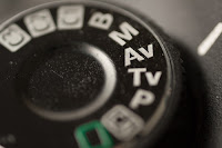
DSLRs and some point-and-shoot cameras have a wheel of shooting settings at the top of the camera.  These can vary from brand to brand, but as a general rule the symbols will be close close, if not exactly the same.  Some cameras have more options.  Some have fewer.  Here, we will go over some of the more popular options and how they can be of use to you.


AUTO or A+: Automatic mode.  This means the camera does everything for you.  I shot exclusively in AUTO for the first few years I had a digital camera simply because I didn't know any better.  I had grown up shooting in film, and while the principles are the same, some of my knowledge got "lost in translation" when I made the move to digital.  Is Automatic the ideal setting because the camera chooses the settings that it believes are best for the situation?  Of course not, and I'll go into more detail on this in later posts.

DISABLING FLASH: This works exactly the same was as AUTO, except the camera will not use the flash, so it is ideal during performances or other situations where flash is either not allowed or gets in the way of your image.  The drawback of this option is that your pictures may come out dark if you are in a low light situation.  Shooting in Manual can help you overcome this, but for now let's stick with baby steps.

PORTRAIT: This mode is designed to bring out the natural skin tones in the human face, but I have had very little success in the past getting a picture to come out looking the way I wanted it to look.  This one always fell in the "useless" category for me.  Try it out if you have the setting on your camera.  Maybe you can figure out what I never could!

LANDSCAPE: This mode comes in very handy when you have a scene where you want everything to be in focus (both things near and far).  When shooting in Manual mode, this is where you would adjust your f-stop to a higher number for a greater depth of field, but for people wanting to keep things simple or who haven't learned enough about Manual, this can be an excellent tool.

MACRO: If you're into nature photography and getting up-close and personal with flowers, seashells, or other subjects that are teeny tiny, this is a fun mode to shoot in!  Keep your background in mind because a busy background can make seeing your subject difficult in the final picture, so try to keep it simple.


ACTION: In layman's terms, this is the mode you want to use if you're photographing something that is moving.  Essentially, what it does is speed up the shutter speed so you will have less blur in your image.  Shooting action shots can be tricky in and of themselves simply due to the time it takes a digital camera to focus before taking the picture.  There are several tricks in avoiding this such as pre-focusing by only pressing the shutter button half-way to allow the camera to focus before pressing it fully to take the picture.  Don't worry.  We will cover this much more thoroughly later on.

NIGHT: This is another one of those modes I thought would be helpful in my early days of photography and settled on it being "useless" instead.  In theory, this mode compensates for low-light situations by using a slower shutter speed and higher ISO, but I had very little success actually putting it into practice.  Beware that any movement in the camera will usually result in a blurry photo, so stabilizing the camera with a tripod or setting it on a solid surface will help you get a cleaner image.


Beyond the basic settings, we get into the semi-automatic settings where you take over adjusting some of the settings while the camera handles others, giving you a little more control over how your pictures will turn out without taking the full responsibility of going Manual.


PROGRAM: This mode allows you to choose the ISO (film speed) and White Balance.  Depending on what you choose, the camera will automatically choose the correct Aperture (f-stop) and shutter speed for the conditions.


S or TV: Shutter Priority mode.  This mode allows you to dictate how fast or slow the shutter will close while the camera automatically chooses the best aperture (f-stop) for the current conditions. (The higher the shutter number, the faster the shutter will open and close.  The smaller the number, the slower the shutter will open and close.)  I could go into so much detail about how to use this mode because I used it a great deal in my early days, but for now I'll just say that while the shutter is open, it lets light in and any movement during that time will cause things to blur.  For a short shutter speed, there is very little chance to have blur, but there is also very little time for light to reach the sensor which can sometimes result in a sharp, but dark, picture.  Learning to use Shutter Priority mode is all about finding the happy medium for your desired shot.

AV: Aperture Priority.  This mode allows you to set your desired aperture (f-stop), ISO, and white balance while the camera chooses the appropriate shutter speed.  This is another one of those shooting modes I used a great deal while learning how to photograph exclusively in manual.  We will be going into f-stops later, but just to get you started, the smaller the f-stop number, the wider the aperture opens when you take a picture.  (I know, it seems counter intuitive, but hang with me.)  Remember that depth of field we briefly mentioned in Landscape Mode?  This is it.  The depth of field is everything within the viewfinder; the things close to your camera (such as your subject) as well as the things far away (such as the background or landscape).  
The wider the aperture opens (the lower the f-stop number), the fewer thing it can focus on when it takes a picture.  Likewise, the smaller the aperture opens (the higher the f-stop number), the more things it can focus on when taking a picture.  Playing with the f-stop is my absolute favorite photography trick!  Shooting with a low f-stop allows me to focus on one single thing and "blur" out everything else because it's simply not in focus.  The picture at the right is an excellent example of a high f-stop number with a greater depth of field vs a low f-stop number with a shallow depth of field.  Notice how a greater depth of field allows the camera to take everything into focus (including the yucky background) in the left image, while the right image uses a shallow depth of field and "hides" everything except the flower?

Beyond these modes is the dreaded Manual mode.  I shivered at the thought of using this until I was forced to play with it for my photography classes.  I can proudly say that I shoot almost exclusively in Manual now, but it took me what felt like ages before I finally got good enough at balancing all the different elements to be able to manipulate the camera into taking really good pictures.

Working with a shallow depth of field (low f-stop number) means you have to be very
careful about where your focus lands.  In the LEFT picture you can see that I accidentally
focused on the tail instead of the unicorn's horn (RIGHT).  A great picture can turn blurry in
a hurry if you use too shallow of a depth of field and accidentally focus in the wrong spot.

*TIP*: Start your photography journey by learning about the mode settings on your particular camera, and how to improve your pictures by choosing the correct one for your current environment.

Please visit my website
www.AshleyGesslerSHD.com

Monday, December 7, 2015

Creating Custom CD Labels

The compact disk may very well be on its way to becoming a relic of the past, but for the moment it still remains a reliable way for me to get pictures from my computer to a paying customer.  When I first checked into custom labels I honestly believed I NEEDED to purchase a program to create the design and print evenly on a round label, as well as an apparatus to apply the labels to the CDs.


After playing with a label maker my dad had been using, I decided I was crafty enough to come up with my own way to get pretty labels onto CDs and still make them look straight and semi-professional.

Here's the tutorial:

I like my disks to be completely covered, so I use Stomper CD Labels because you can either remove the center ring to expose the clear portion of the CD or use them as I have for full coverage.


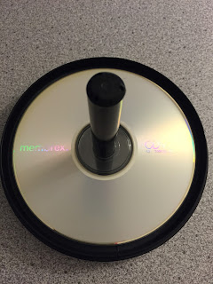
The only material you need (besides a computer and blank labels) is an empty CD tower and the clear protector that comes in the bottom of it.

Using Word, I scaled down my document so the page on the screen was the same size as a normal sheet of paper, which in my case was 94%.  If you don't know how to do this, click 'View' on the top panel, click 'Zoom', and then play with the 'Percent' until you find the number that will display the true size of your document.


Using the same method, I lined up my blank CD label sheet to ensure that my design was going to thoroughly cover the disk and nothing important was going to fall into the center hole.

Print your label.

Drop the clear protector onto your empty CD tower.  This keeps your data-filled CD from getting scratched.  Place your CD on the tower label side up.


Remove the label from the paper.  Hopefully, the brand you choose has the handy little holders like mine did because they can be quite useful.


Carefully slide the label down the tower and let the center pole help you line up your label.


Once your label is applied, tear away the holders and smooth down all the edges of the label so nothing will get off balance when the disk is spinning in a machine.

Please visit my website
www.AshleyGesslerSHD.com

Tuesday, October 6, 2015

Not all edits are created equal

I have had a few people stop me and say they tried editing their photos, but are generally disappointed with the results.  Let me just say, I hear you loud and clear!  Back before I started taking classes on photography and attending workshops on photo editing, I found myself getting more and more frustrated with my own editing results.  Every once in a while I would get lucky and have a picture turn out really amazing with the edits I applied, but I never could pin point why one picture would turn out great while the next (with the very same edits) would turn out blah-zey.

In most cases your editing outcome has nothing to do with your image... it has everything to do with what that preset edit is designed to seek out and change.  If your image doesn't have what that edit is looking for, then it can't edit it correctly.  Make sense?

To edit a great picture, you first have to START with a decent picture.  All the basics have to be there: your subject needs to be shot at the appropriate level (Read: Improving Your Pictures With This One Tiny Adjustment), your background needs to be clean (Read: What's Up With Other Peoples' Photos?), and your subject needs to be sharp and in focus (Read: Have You Heard of a Shooting Mode?).  Regardless of how much editing you do a photo of the top of someone's head will still be a photo of the top of someone's head when you're finished, so you need to be sure you're starting with a quality image first.

It may be a 90 degree October day here in Alabama, but I'm dreaming of cooler weather, so I'm going to use mostly snow pictures for the sake of this blog.  The first was taken while the snow was freshly falling, and the second was taken the next morning of the same bush.


All of these images are completely raw and untouched.  They are decent enough, but let's add some editing touches and see what happens to them.

I'm using a preset I created in Lightroom specifically for my snow photos.  I call it Sweet Snow Sharper.  When using an editing software such as PicMonkey or Snapseed you won't have access to seeing what exactly the effect is designed to do, but after applying it to your images a few times you can probably figure out what exactly it's changing.  Is it darkening your shadows?  Is it lightening your image?  Is it applying a color change?  Is it softening the picture?  Etc.  Etc.  Etc.

Sweet Snow Sharper editing presets

Sweet Snow Sharper is designed to brighten up the typical overcast skies that can be found on a snowy day and bring out the true white by canceling the bluish haze.  In the right conditions it produces a beautiful image such as the one below.  On the left is the original photo, and on the right is the same image with the Sweet Snow Sharper edit applied.  Pretty and white!

Left: Before.  Right: Perfectly white snow with Sweet Snow Sharper

Now, this second image was taken the next morning.  The skies had cleared and the sun was brilliantly shining.  The 'Before' picture was pretty clean on its own, and once I applied the Sweet Snow Sharper edit it fuzzed out my whites and had a truly detrimental effect on the overall image.  The whole thing is glaringly bright.

Bleck!  Same editing tool, but this one turned out too bright!

So, what happened?  My base images were vastly different.  They were shot in completely different lighting conditions, therefore the edit produces completely different results.  This edit brings a brightness that the second image did not need, so the edit unnecessarily brightens the whole picture.

Let's look at another example.  This edit is with my preset Lava Rock which is designed to bring out the contrast between the light and dark areas of the image.  It works well on a well-lit subject to intensify the details.  Just look at how it makes the flower in the lower image seem to pop!

Left: Before.  Right: After applying the Lava Rock edit

When the same Lava Rock edit is applied to our snow photo, it darkens the bush and makes the whole picture feel drab and dreary.  It's a far cry from the edit with Sweet Snow Sharper!

Left: Before.  Right: After applying the Lava Rock edit.  In this situation it looks terrible!

If you're using an edit supplied in one of the editing tools we mentioned in an earlier post (Read: My Preferred Programs For Editing) then you may or may not know exactly what the edit is designed to do.  When I'm using a program such as PicMonkey, I like to apply a chosen effect, see what it does, and build from there.  If the edit produced a yucky picture then I wipe it out and try something else.

Editing can be a tricky business, and no one is ever truly finished with learning about how to improve images.  It's always a never-ending process of evolution, so don't give up!  I went through years of yucky edits before I started figuring things out, so there is hope for everyone.

Please visit my website
www.AshleyGesslerSHD.com